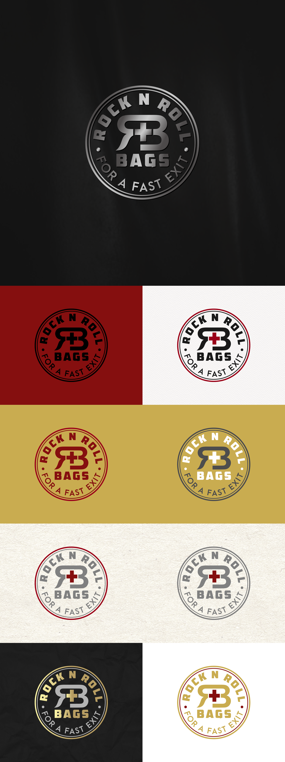

core theme of this brand are emergency supplies and survival gear, but it need to standout from para-military prepping crowd , since their target audience mostly married couple 40+ in age (with or without kids) who are upwardly mobile and live in safe neighborhoods and have a lifestyle where they feel safe - but aren't prepared for anything to ever go wrong. That's why with i make this logo with different approach ; not so "rock n roll's stuff " , i also make initial "RB" look kinda lux feel , not to forget to mention , i add univrsal cross icon as symbol to accelerate with theme of product which is about survival in emergencies situations . Overall, this logo convincing quality , and still look bold , elegant , eye catchy , also can woks very well on any colors that posible either any printing metode .
: )