Background information
Name to incorporate in the logo
SalesWIP
Slogan to incorporate in the logo
Simple Accurate Revenue Forecasting
Description of the organization and its target audience
We sell a software that is designed for companies to quickly and accurately forecast their sales revenues. I elaborate more below.
The SalesWIP is a CRM plugin designed to provide simple and accurate sales forecasts. It uses a combination of Monte Carlo analytics and Intuitive Revenue Profiling. Designed to answer the seemingly simple, but frequently confounding question: “What’s in Your Sales Pipeline?” - the SalesWIP’s 24-7 availability, coupled with its easy-to-use interface, allows for immediate results that are always available within seconds of the tough question being asked.
The SalesWIP is designed to be a crucial tool for any individual within a company of any industry interested in seeing their financial expectations. Whether the end user is a member of a Sales Team, Board Member, Financial Analyst, or C-Level Executive: the SalesWIP is designed to provide any end-user with a forecasting tool that is always available, easy to use, and provides accurate forecast reports.
When a user enters data points into an opportunity in their SalesForce or Hubspot account, the SalesWIP uses the probability of the opportunity closing, the expected deal’s lifespan, and revenue to generate a Monte Carlo report to show users the most probable financial outcomes for each month within a previously selected timeframe.
Industry
Business & Consulting


References


Other notes
Hello and thank you for looking for working with us.
I attached a file that will allow you to see what our current logo/situation is.
Things we like:
-The colors (green and black)
- Minimalism
- Strait lines/minimal curves
Things we DO NOT like:
- the existing typeface for "SalesWIP" is too "thick". It should be more "sleek" and modern (thinner letters)
- The actual icon (The box with a checkmark and graph in it) it terrible - we are not married to any part of it whatsoever. We ESPECIALLY do not like the checkmark or the lightning-bolt style graph line. You will notice on the check mark there is a weird highlight/gradient as well. We do not want any of those effects at all.
You will find images from our actual product below. Feel free to use any of these as influences.
First: The full logo with name and slogan
Second: The stand-alone icon
Third: The SalesWIP itself
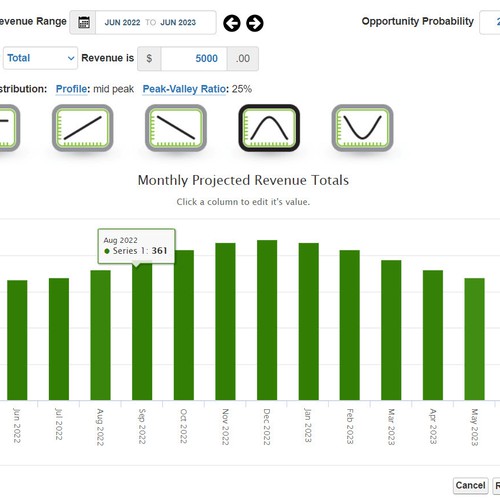
Fourth: Revenue Profile (please keep in mind we only want to use the colors green, black, and white)
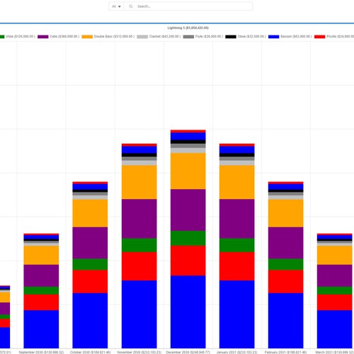
Fifth: Monte Carlo Analysis
Again: Thank you!
Contest deliverables
1 x Logo
Final files
If you use fonts that require a license, confirm with the client they're ok with it. For licensing reasons, it is better to provide your client with information on how to acquire the font rather than providing the actual files.
Text in logos should be converted to outlines.