Background information
Name to incorporate in the logo
Yellow Raincoat
Slogan to incorporate in the logo
Description of the organization and its target audience
I am an independent web developer focussing on the backend side of things, so more technical than visual. I work with all sorts of companies (although start-ups and SMEs are the bulk of it), usually providing support for their in-house tech team. I also sometimes take on greenfield projects on my own – projects that need building from the ground up, with no existing team.
Industry
Technology
Visual style
Colors to explore

Other color requirements
Must include the yellow/orange used for the logo but other than that, whatever you think works
Style Attributes
Design inspiration
References
Attachments
Other notes
My goal is to build a website for my company that would centralise my online presence, which is a bit all over the place at the moment.
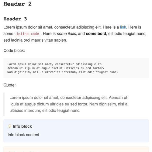
I will deal with the website's design myself, but what's important to note is that I'm aiming for minimalism with a focus on the reading experience – the website will have a blog section where most of the content will be. I've enclosed a screenshot containing all the various text styles from my current blog, to give you an idea.
I'm planning to use a white background for the website.
Here are some pointers for the logo itself:
- While I'm aiming at a minimalist design for my website, it doesn't mean that the logo has to be too (as long as you think it'd work with a minimalist design)
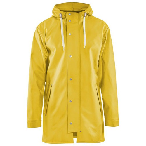
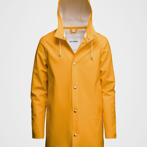
- The company is called Yellow Raincoat so I'd expect that to be part of the logo somehow (I've enclosed an example of the kind of yellow raincoats I'm talking about)
- I thought focussing on the hood could be cool
- I'd like some colour. Some yellow/orange for sure. It'd be fine if that's the only/dominant colour (or some shades of it)
- Don't try too hard to convey what the company does through the logo
- If you decide to incorporate the company name (you don't have to), I'd also like the logo to be usable without the company name
That being said, feel free to ignore this list if you think you've got a much better concept! It's based on a vague idea I've got for the logo, but happy to be convinced otherwise if you feel inspired.
UPDATE 1:
- I appreciate the submissions not using the yellow raincoat in any way, but if you go down that road I'd expect something a bit original nevertheless. I believe the company's name is a bit quirky and an opportunity for a logo that stands out – some more "traditional" geometrical patterns that evoke tech is not what I'm after
- I realise that designs based on a raincoat (albeit yellow) can quickly look like I'm a psycho lurking on the internet or a hacker (especially when focussing on the hood). I'd say be careful not to convey that image, although I realise it may be a difficult balance to strike. Logos based on the hood are definitely the ones I like the most so far though
- On that note, submissions using the entire raincoat are well designed but the corresponding logos feel "big". I'm after something more discrete
- Also, a number of submissions mingle the logo and the text – remember that if you're incorporating the text (which is fine), I also want to able to use the logo without the text
UPDATE 2:
Something else I realised while replying to some messages – I like the idea of the logo fitting within a square or circle. I know everything will fit within such a shape given the right size, but what I mean is that logos whose height is disproportionately greater than their width (or the other way around) don't work as well for me.
Note that this doesn't include the text – the text doesn't have to fit in that square or circle, so long as the logo is also usable without the text, as previously mentioned.
UPDATE 3:
A few of you have provided variations with different background colours (white, yellow and black). While the brief admittedly only mentions a white background, I now like the idea of a versatile logo, so if you could show me examples of your idea for those three background colours, that'd be amazing!
Contest deliverables
1 x Logo
Winner of this contest
1 x Brand guide
Final files
If you use fonts that require a license, confirm with the client they're ok with it. For licensing reasons, it is better to provide your client with information on how to acquire the font rather than providing the actual files.
Text in logos should be converted to outlines.
