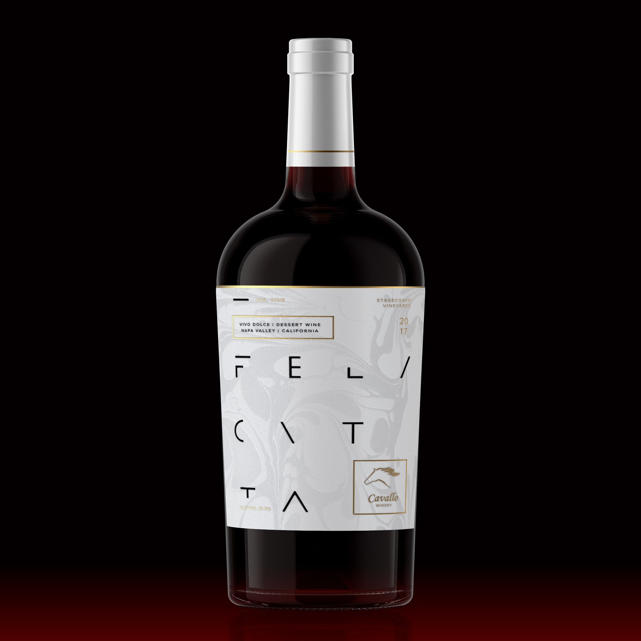

The labels are clean so the eye can focus in this ever cluttered digital world. Colors are nostalgic & comforting, like a good glass of wine. Elevated by metallics as material innovations are more important then ever to stand out in a sea of beautiful curation, creating elegancy and a touch of class. The Swirl embossing in the label is to represent a rich, bold, smooth, silky blend of wine, while also giving a visual representation of dessert. I used San Serif type, to give a more modern feel, creating luxury, while keeping the design very minimalistic. The use of the rounded radiuses and slenderness to give a more feminine feeling. The spacing gives a calm collected feel of happiness, living up to its name, Felicitta. Applied in a UV varnish to add texture and to catch the light.