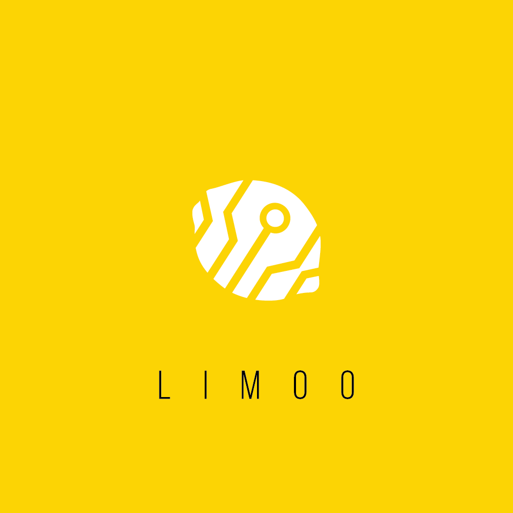

"Limoo" is a fresh, new Web & Mobile consultancy started by a young entrepreneur who has a background in Technology, Video Content and Electronic Music production. The client needed something modern and clean that said "Limoo" in an absolute minimalistic manner with an abstract logo that could convey their services and background values. And hence this logo was born.
The word "Limoo" immediately brings up an image of a lemon to one's mind and with it comes the imagination of something refreshing, zingy and energetic! Hence the bright yellow with the white to create for that zing contrasted with the dark grey and the black to maintain aesthetic balance. The "lemon" monogram relates to the "Limoo" name and the tech-looking lines representing a circuit convey the IT and Electronic Music production related values of the client's brand.