A grungy logo design for a streetwear apparel business.

0
Created on 99designs by Vista
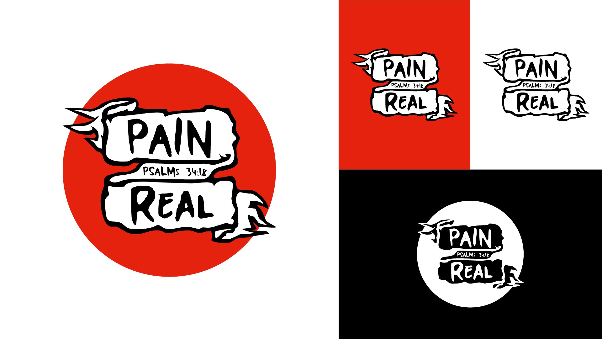
To ensure scalability the design was kept relatively simple - more than the previously uploaded design. This is imperative, especially for an apparel business, where the logo needs to be distinguishable at various sizes, whether it be on a tag or the main print.
The design was kept simple with the choice of font and high contrast colours.
The font used in this design offers a more "playful" approach. It also opened up room on the ribbon to be scaled inwards, allowing the design to be larger and more scaleable.
The use of the medieval-like scroll/ribbon depicts a sense of triumph as if you had overcome a battle and were wrapping your wounds.
A circle backdrop has been used to cement the design and offer a more playful look.