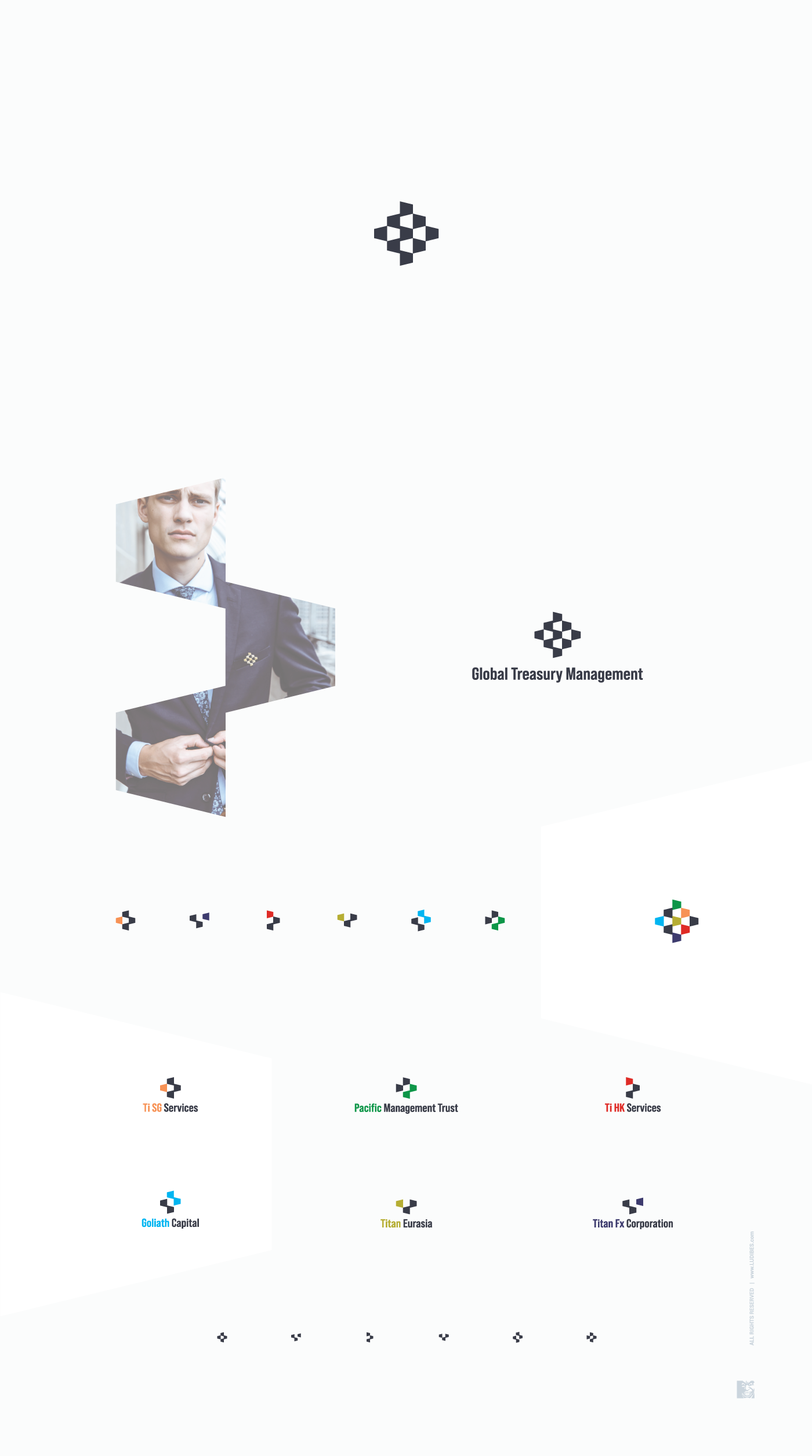

For a global financial corporation, here are logo designs for parent company and its 6 branches set up all around the world. Starting with parent logo and throughout whole family, designs are modern and minimalistic. Inspired by simple geometry and all based on one repeating and morphing shape, logos inspires thoughts of finance, capital and management while still apealing to tech folks. Icons are paired with serious looking modern sans lettering and features soft black as main color, each having splash of unique shade that could be shown all together in parent icon. Of course, each logo works just as well in black and white. Sophistication in simplicity, with added sense of third dimmension gives these logos dynamic feel and I can easily imagine them even animated in the future :)