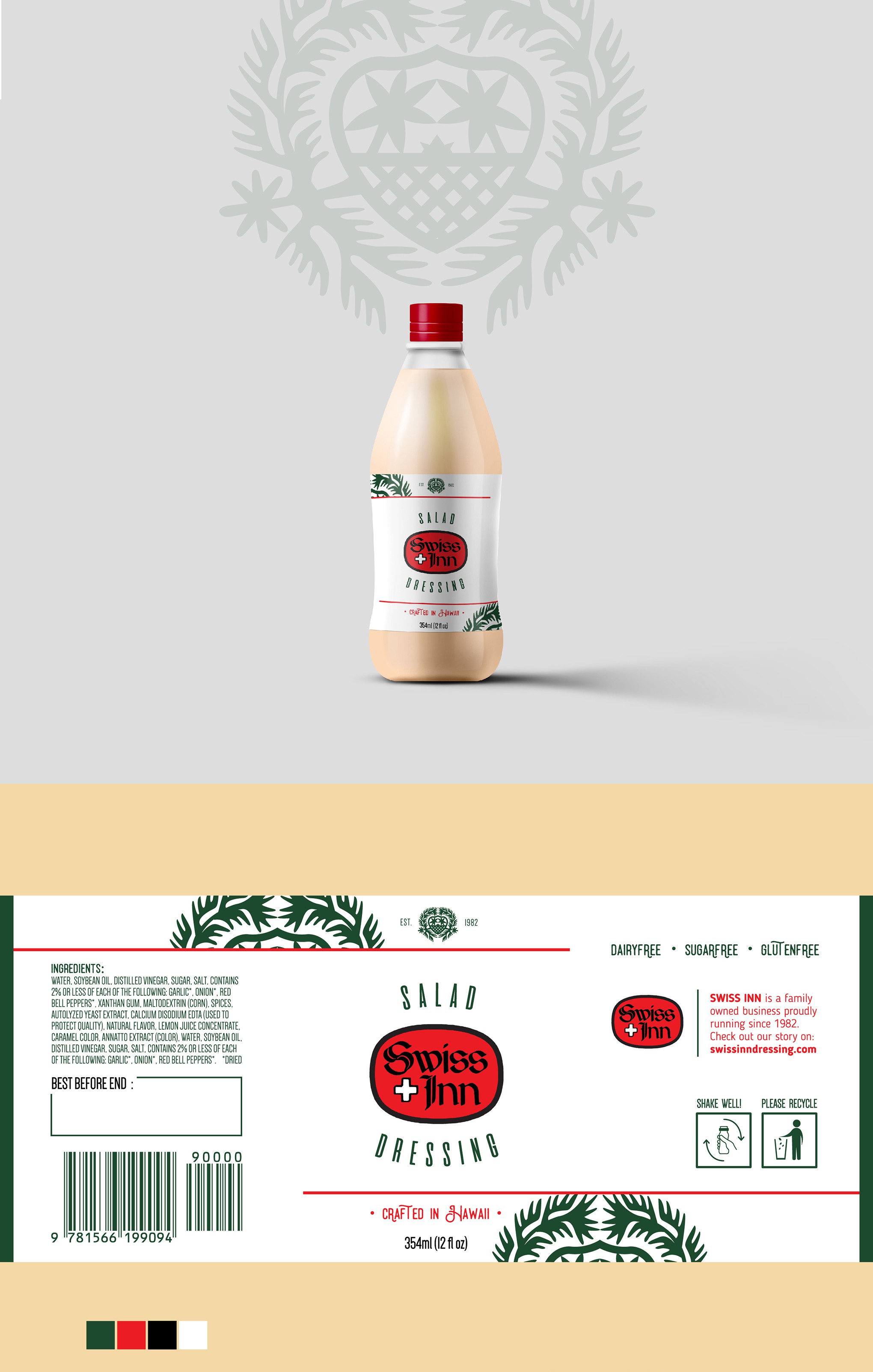
Label Design for Swiss Inn - a popular, historical hawaiian dressing salad brand.

14
Created on 99designs by Vista
The main task was re-interpreting a well-known and well-loved imagery connected to the product, so to make customers feel both a sense of novelty and familiarity, and to make it clear they're getting the same product in a different packaging. The re-branding process got thus centered on the emblem depicted on the background of the old label, also as a reminder of the decades-long legacy of the business and its creators, paired with the introduction of historical hints regarding the family-run business. The final version also features some floral elements and highlights the importance of a locally-crafted product, as envisioned by the client.