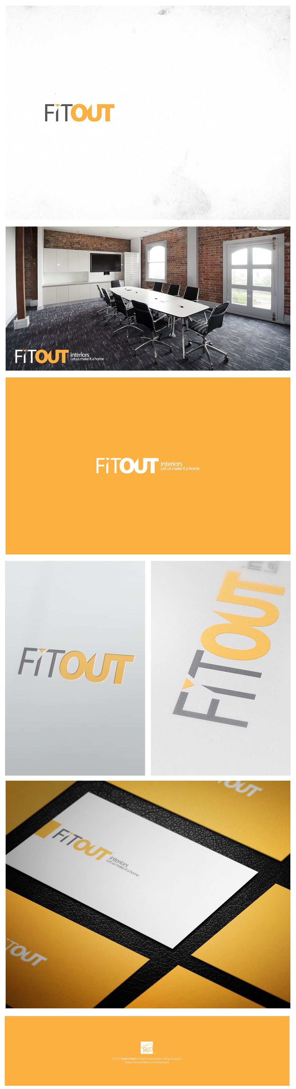

The FitOut logo design combines strong typography with a vibrant color palette to reflect energy, transformation, and modernity. The emphasis on “OUT” in a bold orange tone symbolizes fresh beginnings and creative interior solutions that stand out.
This identity was designed for a forward-thinking interior design company. The clean, sans-serif font paired with the subtle triangle detail adds a touch of architectural precision, making it ideal for a brand focused on stylish, functional living and workspaces.
Versatility was key in this project—the logo translates seamlessly across mediums, from office signage and business cards to digital platforms. It maintains clarity and personality at every scale, ensuring brand recognition and consistency.