
1. Using a Sans Serif style font, which font has the impression of being luxurious, elegant, expensive, and exclusive. It is hoped that it will add value to your product
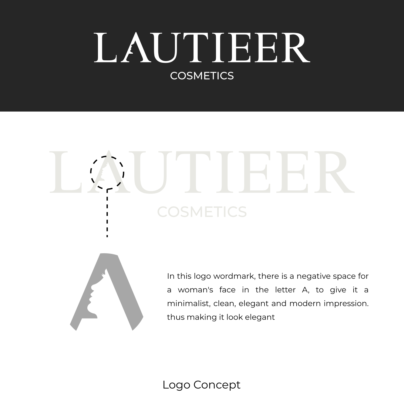
2. Using negative space for the woman's face (in letter A). which describes feminine, calm, and not aggressive. thereby adding to the exclusive value of the wordmark.
It is hoped that the combination of these 2 meanings will produce a wordmark logo that matches your expectations, and can add value to your product. which with that will increase your customer interest in the future.
And I have given a preview with an image that matches your logo, namely for some of the existing cosmetic product packaging mokups. With the new LAUTIEER logo design, it is hoped that it can make your company have its own characteristics and uniqueness from competing brands and make it easier for customers to remember your brand.
Feel free to give me feedback.
Tell me if you like it. Thank you!