
The website for Live to Flourish beautifully reflects Stephanie Ulfig’s mission of helping individuals thrive and grow through a holistic approach to healing.
Design Highlight: Soft, Healing Color Palette
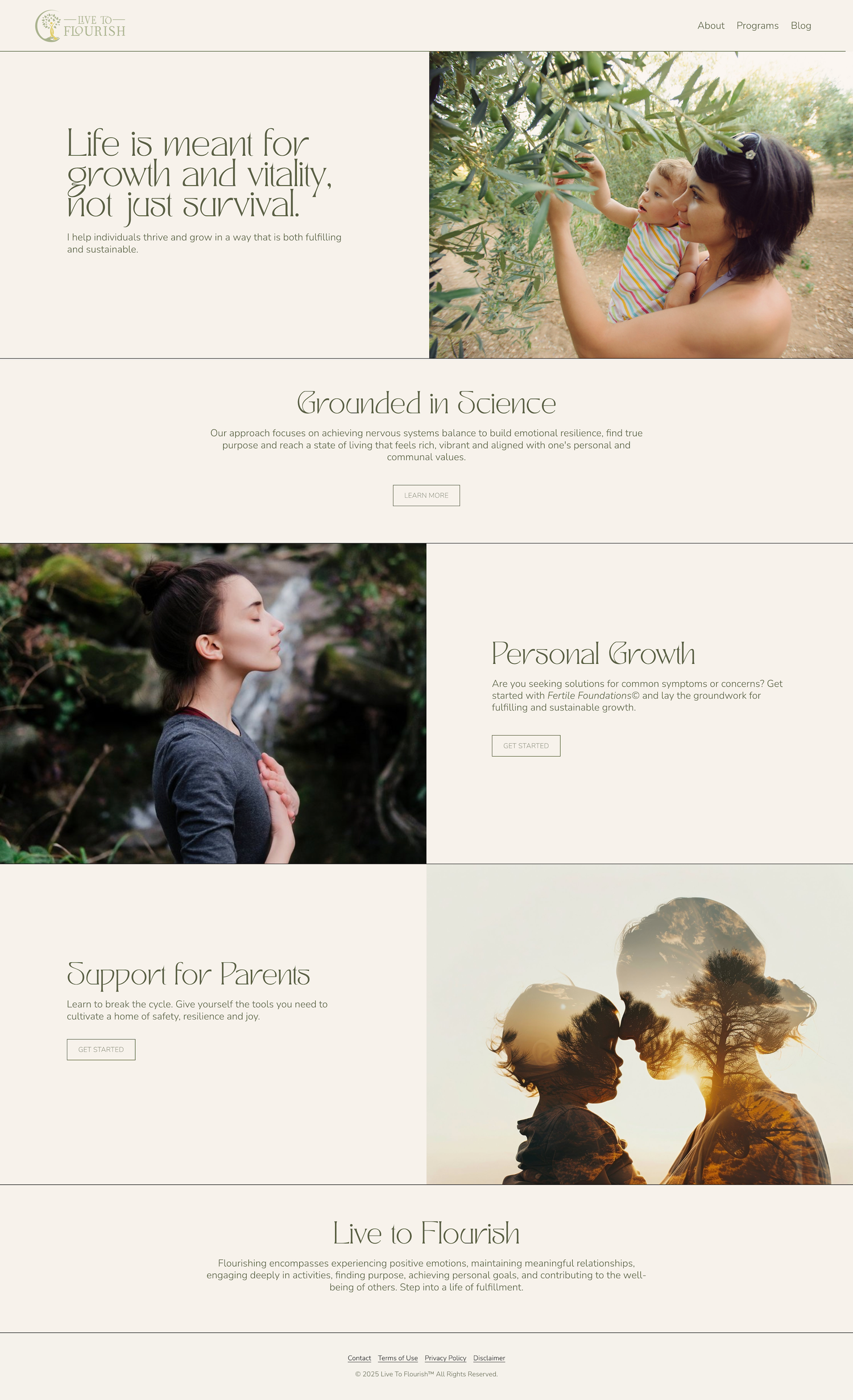
The site’s palette of warm ivory/beige and a rich dark green creates a serene and restorative atmosphere. These colors draw visitors and set the tone for an experience that feels both nurturing and empowering by:
Evoking Warmth and Comfort: The ivory tones provide a soft, welcoming backdrop that feels safe and inviting.
Inspiring Growth and Vitality: The warm dark green symbolizes growth, harmony, and connection to nature, aligning with the site’s message of thriving and flourishing.
Creating Balance: The interplay of these tones establishes a sense of equilibrium, reinforcing the site’s focus on emotional and nervous system balance.