
Created on 99designs by Vista
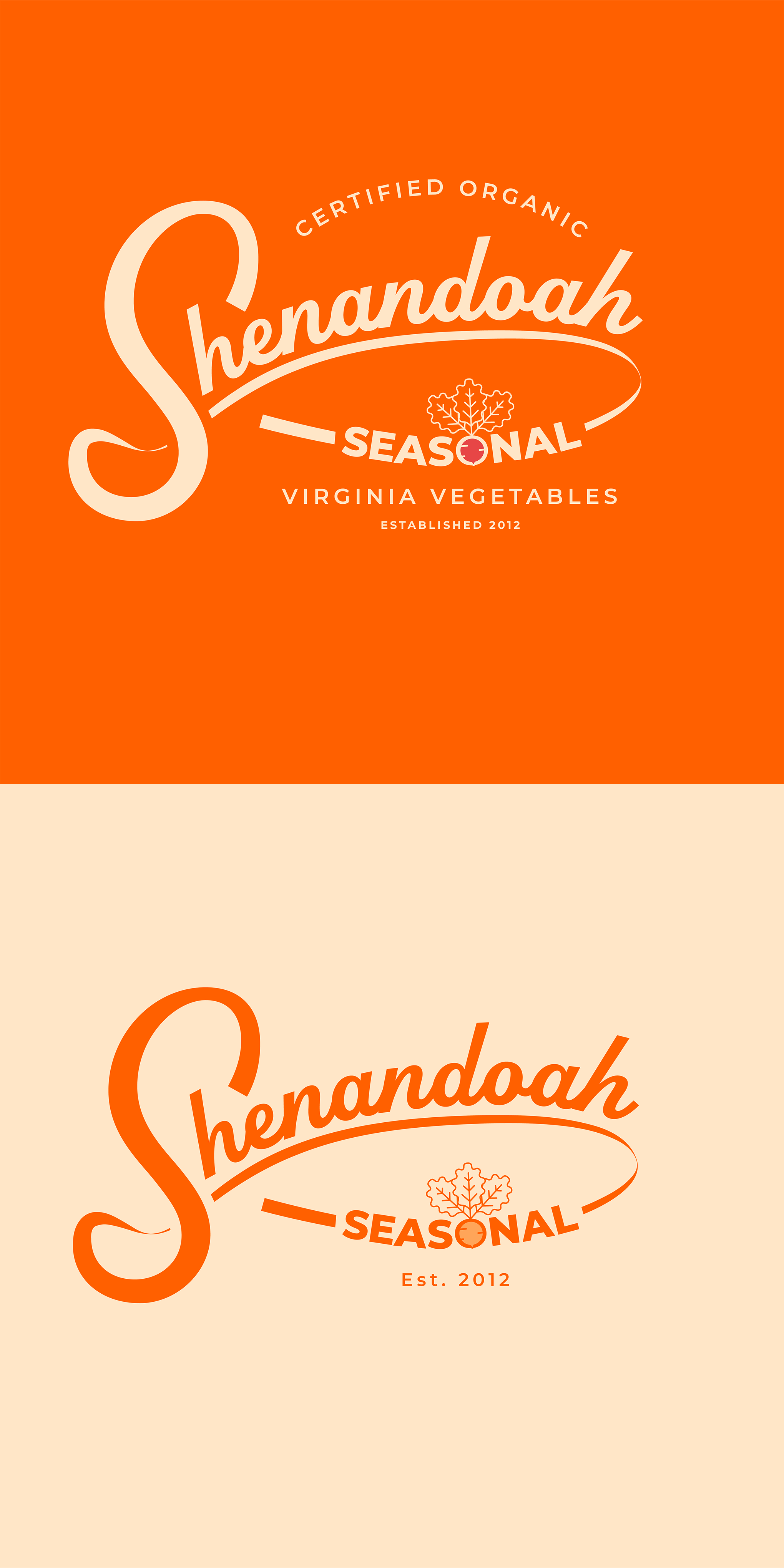
Going through the brief and ideas for the logo, I still feel a well-stylised "S" will make the logotype stand out because of the unique name you have.
So I created a movement of the logo you wanted leading your eye to the rest of the logo name and with a type treatment on the "O" illustrating a reddish to make it feel more custom.
When I was designing the logo I wanted the logo to be able to blend into any collaterals you might think of especially packaging if that's in the cards already or a future thought.
The logo needs to tell a story too and speak to your customers.