
Created on 99designs by Vista
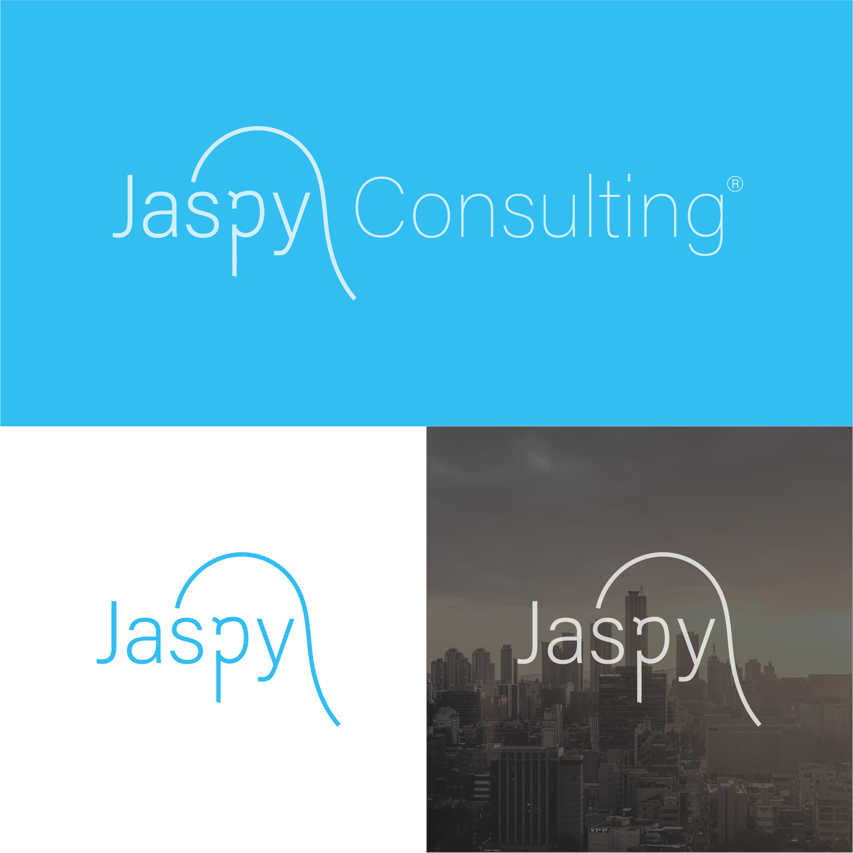
Combining feminine and modern concept is my goal. As a consulting company, I tought you guys must be a good listener. You might notice that "p" on this logo is representing an "ear". And a curve line all the way from the "s" till the end of the logo, it's represent a woman hair. Which actually a good combination that women usually simbolized as a good listener. Obviously perfect for feminine concept that you asked. I keep the shape to be as simple as possible to make sure this logo had a stong character and perfect for full visual brand identity.