
Created on 99designs by Vista
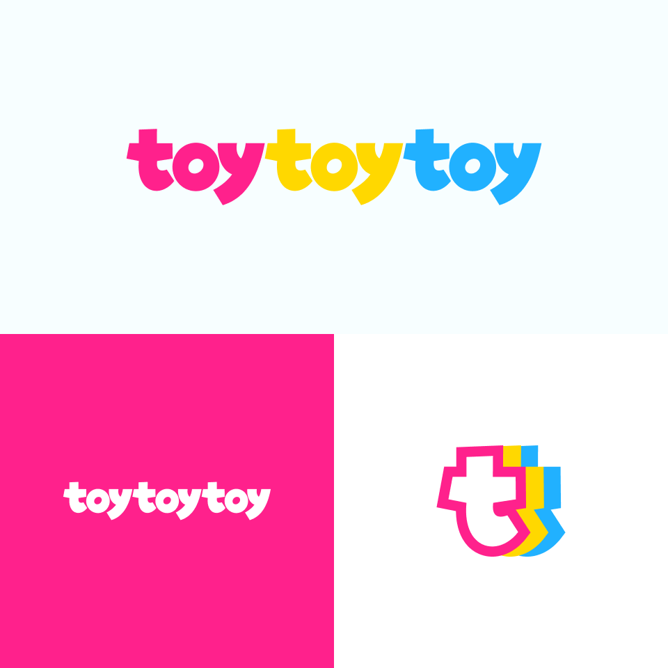
I explored custom lettering and landed on this playful result. One of the main concerns of this logo was legibility in a website header so the letter weight is quite heavy not only for a playful look but also readability at smaller sizes.
The condensed letter mark hints at the repeating t’s of toytoytoy without taking too much space, placing the letterform in 3D space.