Fashion Retailer in Need of Logo

0
Created on 99designs by Vista
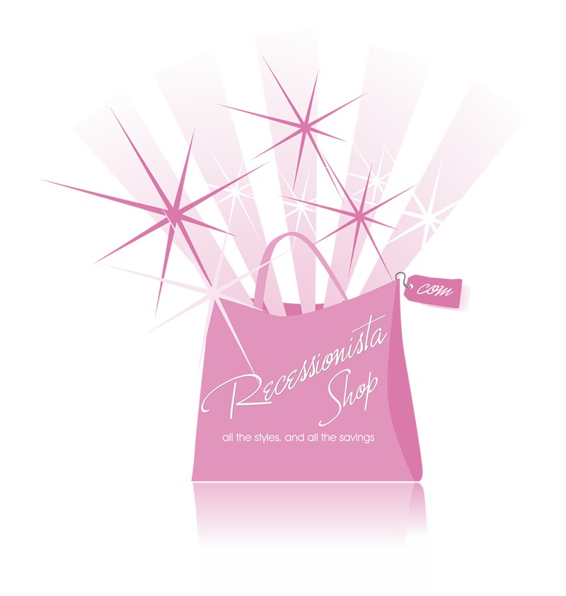
I had previewed the CH's website prior to coming up with the design, and followed their request regarding color. The CH gave great liberties regarding the design elements, so I chose a 'shopping bag' as imagery to encompass all aspects of shopping instead of just specific items. The 'rays' and 'stars' symbolized the savings 'inside' and the font supported the feminine aspects of the online store.