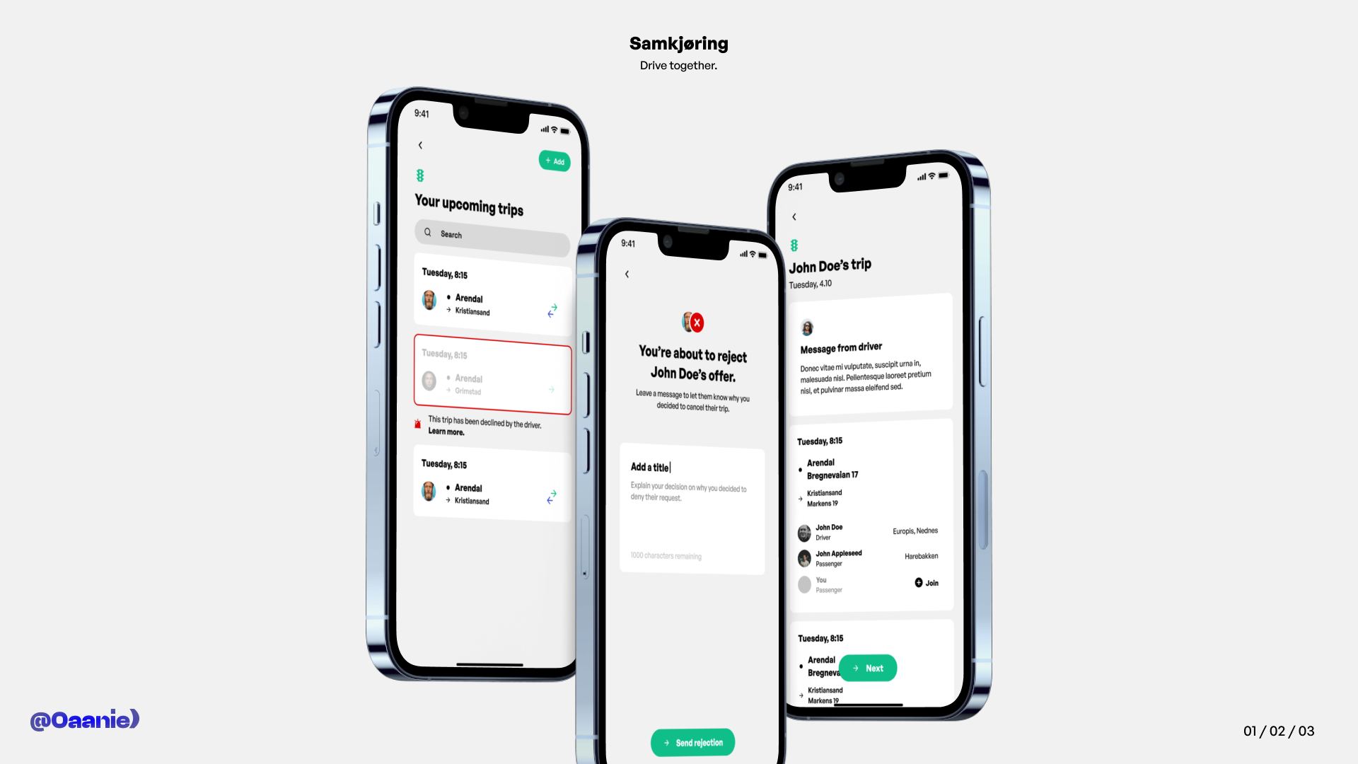

This is the first part of the design showcase of Samkjøring. It includes the screens for the user's upcoming trips, the rejection screen, as well as a frame with detailed information about a user's current trip.
Throughout the entire design, a big inspiration for my ideas was the Uber app. While straying to add a unique touch and not borrowing too much from it, I can't lie when I say that the existing Uber app played a big role in my design decisions. I've gone with a minimal gray-white solution for the project, adding an accent color for the first-priority elements on the screen (which can, of course, be changed). I've divided the design into "boxes", which divide all important elements on the screen into different categories, as to differentiate from them.